The project I would like to share with you today is a book/poster for Typography III. We were told to read the essay
The Crystal Goblet by Beatrice Warde and then lay it out in a way that showed our interpretation and opinion on the subject. The main idea that Beatrice Warde was trying to get across in this essay is that typography should only be used for conveying information; she believed that the typography itself should be invisible so that the message can shine through without distraction. I agree that there is a time and a place for invisible typography, but I disagree that it must always be that way. I believe typography can be an art form not in just laying out information but also in the way the letters themselves are constructed. While it may not always be appropriate, there are times when expressive, possibly unreadable typography can be used to get across a point or just be a beautiful form in itself. Typography is such a rich subject filled with meaning and history that I don't understand why Beatrice Warde believes it should be limited to just one purpose.
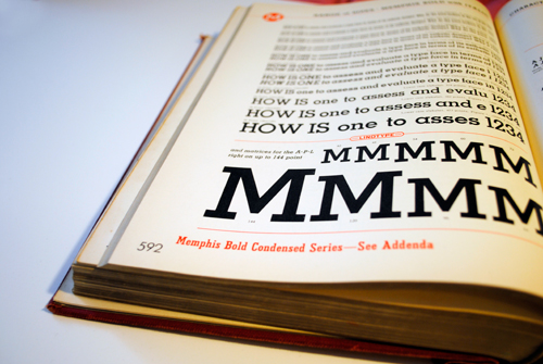
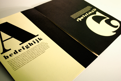
When it came to doing the actual project, I took inspiration from the layout of linotype books, since the typography in these books is not supposed to be invisible. In fact, the whole purpose of these books is to show the forms and uses of all the different typeface options so linotype machine owners will purchase them.
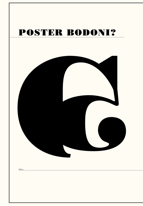
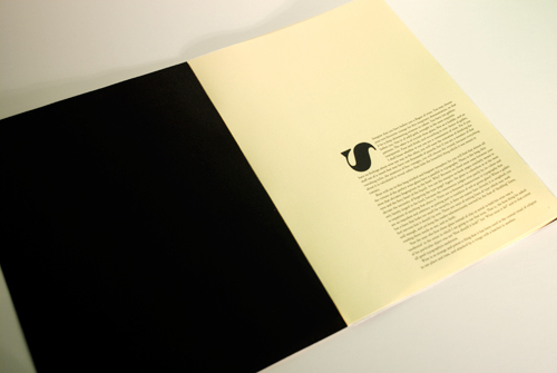
However, I decided to design some of my own letterforms which may not mean anything to us English-speakers but can still be beautiful in their own right. I based my letterforms on the typeface Poster Bodoni, designed by Chauncey H. Griffith in 1929 and based on Bodoni, designed by Giambattista Bodoni in 1798.
Poster:
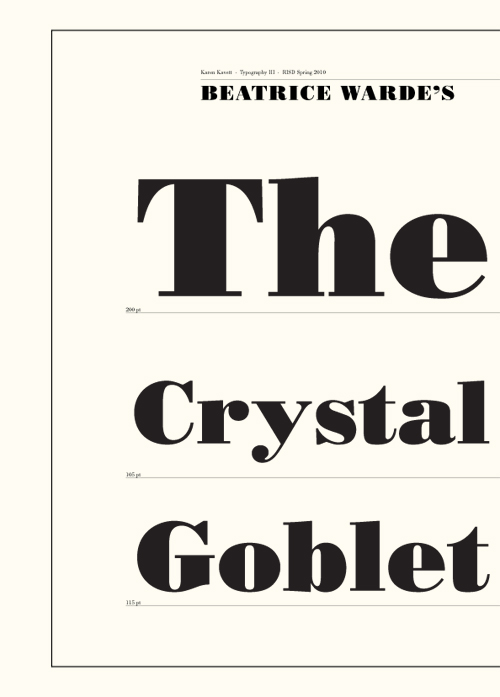
Book:
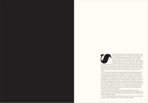
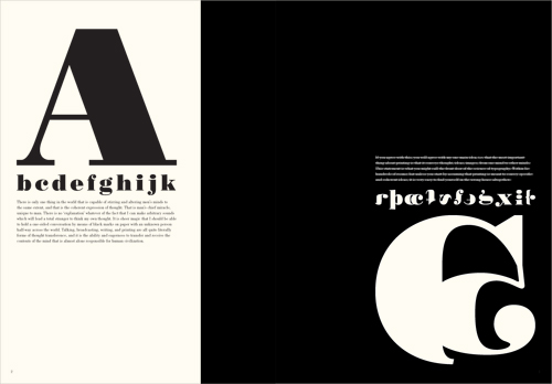
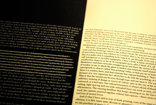
In these spreads I crossed out what I felt were the most typographically limiting points in her essay.
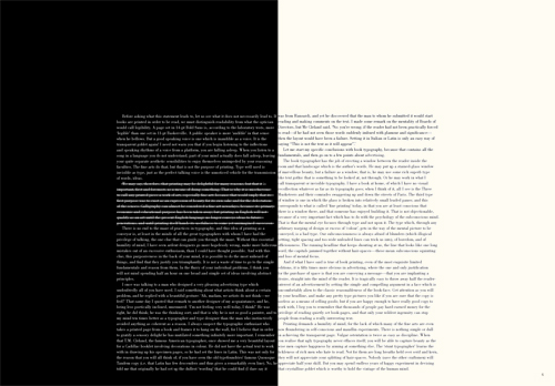
I printed it on a textured cream colored paper, to try to soften the harshness of so much solid black on white. It also invokes a feeling of history, which is appropriate since this project needs so much historical context to be meaningful.
You're brilliant Karen. It's clear that you're passionate about what you do and put a lot of thought into projects. Nerd ;)
ReplyDeleteYour passion for typography is infectious - in a good way! After watching one of your youtube videos on the subject, I am now noticing letterforms more and more: even going so far as to do a double-take when I first realized that my keyboard is Helvetica, and feeling a strange mix of revulsion and irony from a bulk-mailed letter trying a (technically not illegal) scam to acquire some of my shares at a fraction of their market value. Irony because the letter was printed in Ariel, the ultimate cheapskate knockoff font.
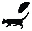
ReplyDeleteYour first "Poster Bodoni" glyph gives me an association with the old cartoon character "Felix the Cat". In case you are interested in Rorschach inkblot tests for strangers on the internet ...