Monday, August 16, 2010
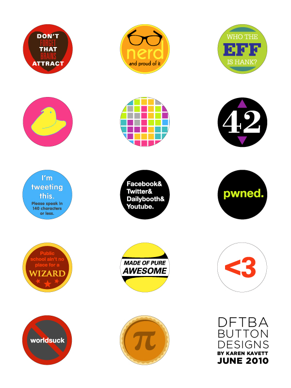
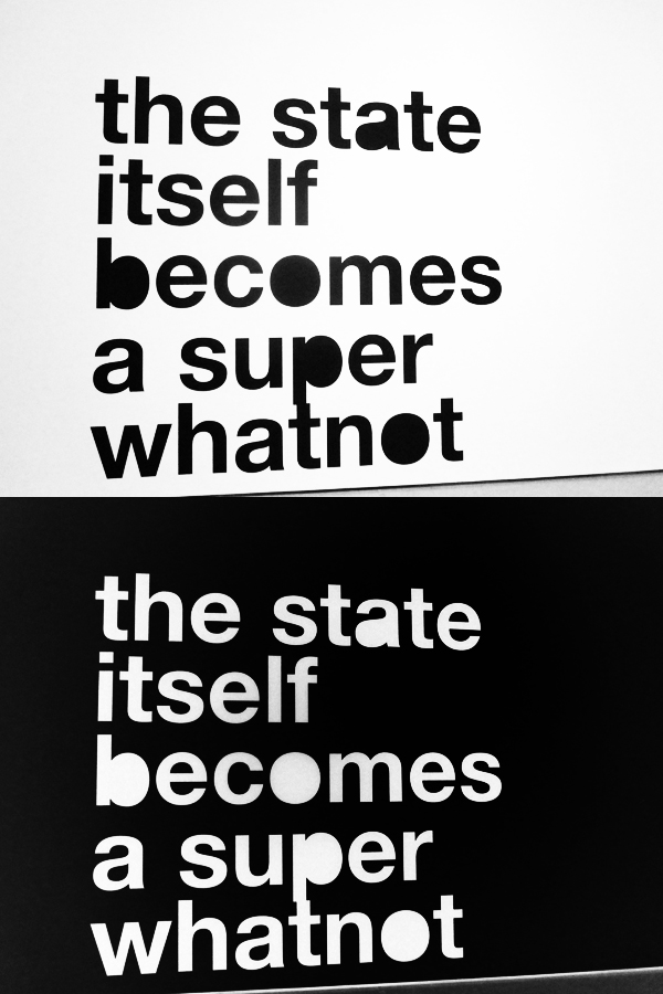
Nerdfighter Buttons
Back in June, Alan asked a bunch of artists to design some buttons for the new DFTBA button pack, which is still yet to released. I figured I would post mine here before I completely forget I had designed them, which tends to happen with projects that aren't released to the public right away. Let me know which ones you might want as actual buttons in the comments and maybe someday they'll be made!
Sunday, August 15, 2010
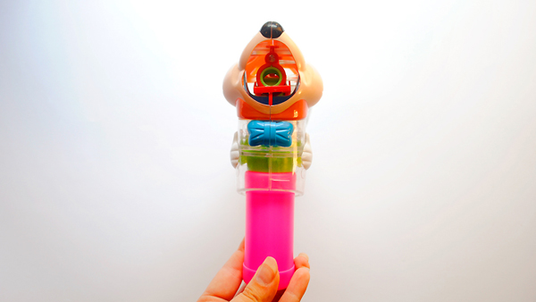
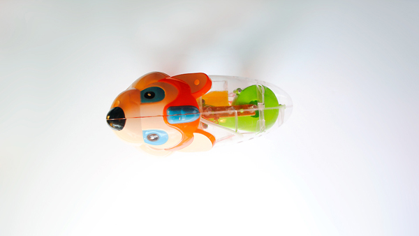
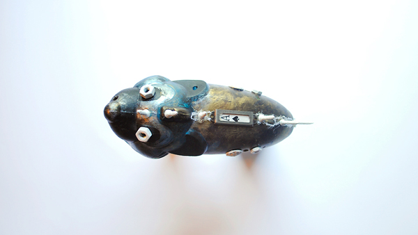
Steampunk Bubble Gun
I always mean to make blog posts about the videos I post, and then just kind of forget. But this one is happening, even if it's a week late. First, check out the video of me painting a steampunk bubble gun, and then read on for a bit more behind-the-scenes info.
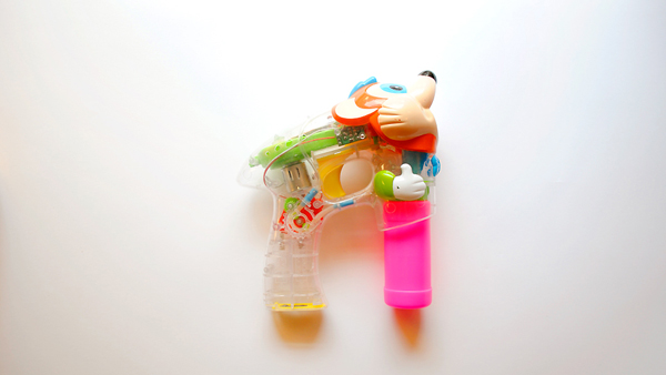
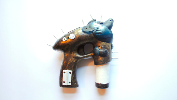
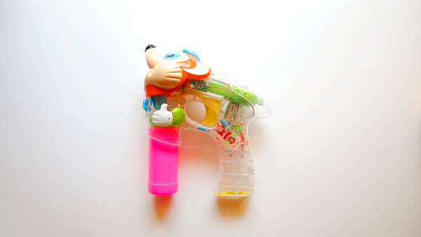
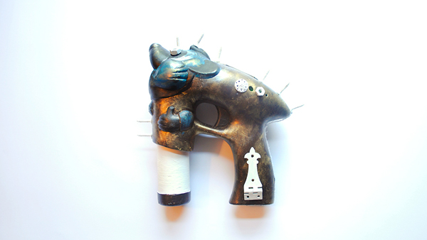
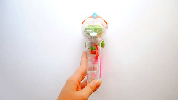
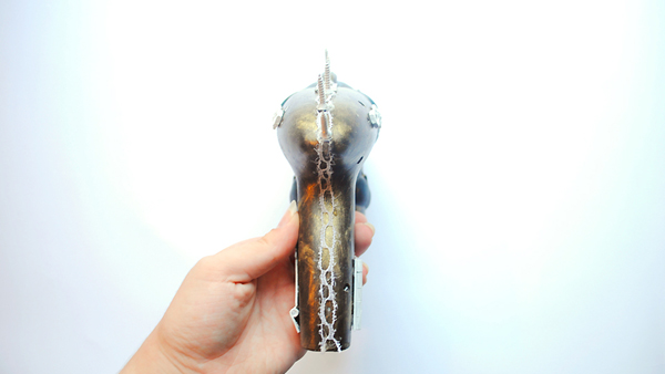
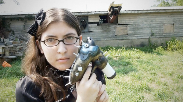
I got the bubble gun from my friend Robyn after the Times Square bubble battle, since she didn't want it anymore. While it was cute as is, I thought it would be even more awesome if it was painted to be steampunk. As you can see from the video, I first sanded the plastic a bit so the paint would stick better and then put on a white base coat. It would probably have looked neater if I had used spray paint instead of acrylic, but I didn't have spray paint and acrylic is a lot easier to do quickly. Then I just kind of went crazy on it with the brown and blue paint, which I then went over with gold to look a bit more aged. I thought the whole thing was looking a bit grimy overall, so then I decided to make the little doodads that I glued on bright white to add a bit of contrast. It was tough getting the cartoon head to not look so cutesy, and I probably should have done what one commenter suggested and used modeling clay to alter the shape of the head to begin with. But I did the best I could for my first time trying this style, especially in the only about five hours it took.
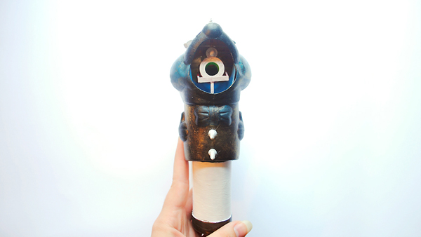
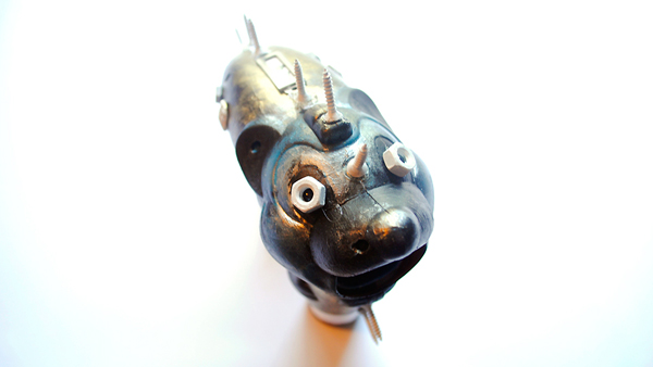
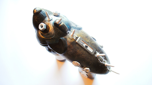
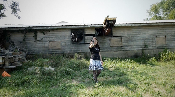
When it came to making the video, I knew even before I started that I wanted it to be set to Joseph Birdsong's song Hologram, mostly because I've been obsessed with it since I first heard it a few weeks ago. The outfit I wore at the end of the video is one I just kind of put together in about fifteen minutes before I left to film it. The shirt I got from a vintage clothing store in Brooklyn a few weeks ago, and the skirt is actually a dress that I picked up from a free stuff pile at the end of my sophomore year of college. I got the bow headband at Forever 21 and the tights for $2 from Urban Outfitters. I had brought black heels with me to put on, but I thought the grass was long enough that you couldn't tell I was still wearing my Converses, but I was wrong and that ended up being the main thing I wish I could have changed about the video. But I think it came out really nicely overall, and let me know if you agree!
I got the bubble gun from my friend Robyn after the Times Square bubble battle, since she didn't want it anymore. While it was cute as is, I thought it would be even more awesome if it was painted to be steampunk. As you can see from the video, I first sanded the plastic a bit so the paint would stick better and then put on a white base coat. It would probably have looked neater if I had used spray paint instead of acrylic, but I didn't have spray paint and acrylic is a lot easier to do quickly. Then I just kind of went crazy on it with the brown and blue paint, which I then went over with gold to look a bit more aged. I thought the whole thing was looking a bit grimy overall, so then I decided to make the little doodads that I glued on bright white to add a bit of contrast. It was tough getting the cartoon head to not look so cutesy, and I probably should have done what one commenter suggested and used modeling clay to alter the shape of the head to begin with. But I did the best I could for my first time trying this style, especially in the only about five hours it took.
When it came to making the video, I knew even before I started that I wanted it to be set to Joseph Birdsong's song Hologram, mostly because I've been obsessed with it since I first heard it a few weeks ago. The outfit I wore at the end of the video is one I just kind of put together in about fifteen minutes before I left to film it. The shirt I got from a vintage clothing store in Brooklyn a few weeks ago, and the skirt is actually a dress that I picked up from a free stuff pile at the end of my sophomore year of college. I got the bow headband at Forever 21 and the tights for $2 from Urban Outfitters. I had brought black heels with me to put on, but I thought the grass was long enough that you couldn't tell I was still wearing my Converses, but I was wrong and that ended up being the main thing I wish I could have changed about the video. But I think it came out really nicely overall, and let me know if you agree!
Tuesday, July 27, 2010
MoMA Photography
On Sunday the 25th, my friend Bin and I decided to get our art on and visit the Museum of Modern Art. It was fun, and I took a ton of photos, which you no doubt can see below.
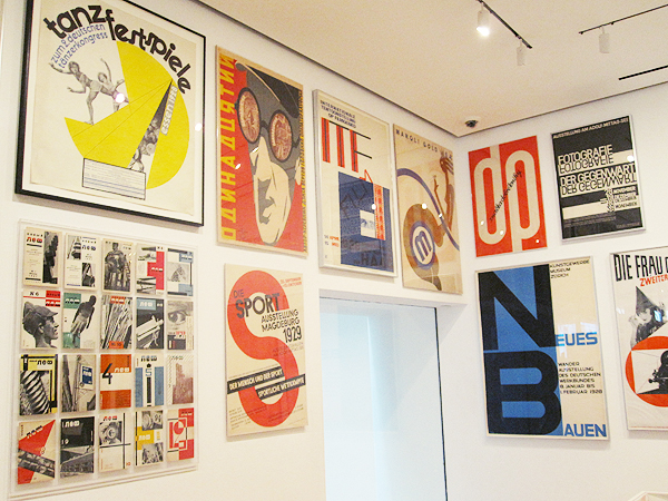
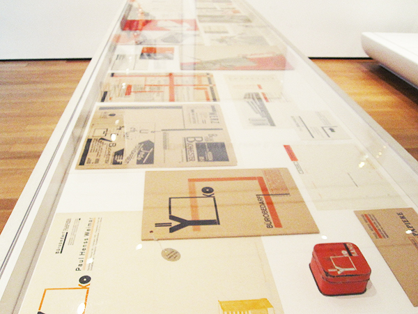
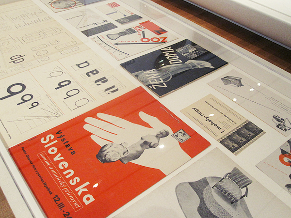
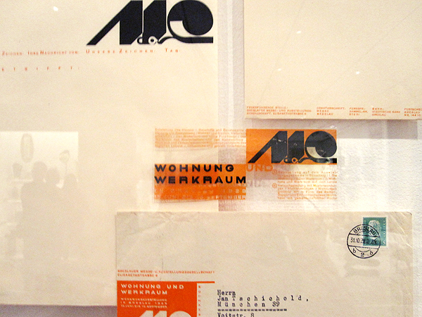
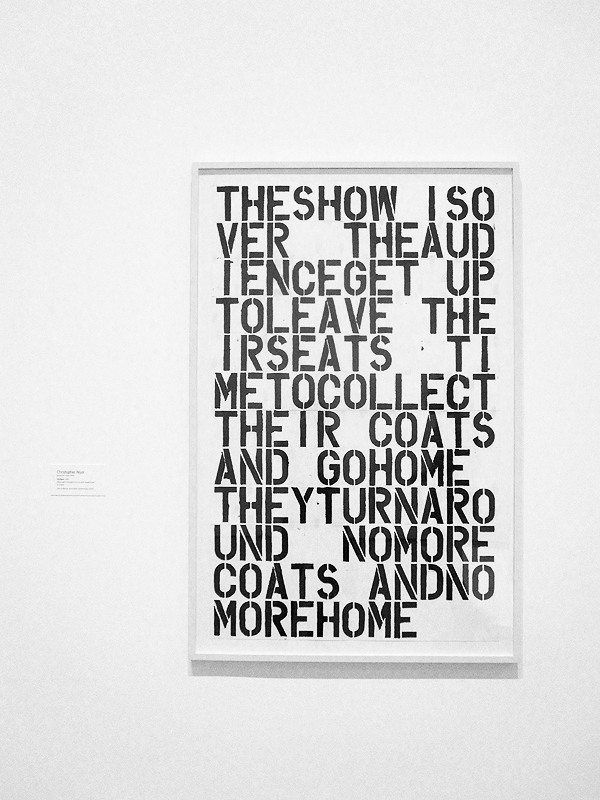
There was an amazing typography exhibit which is going to be taken down this week (which is why we went on the day we did). So many of those posters I've cited as inspiration throughout my time at RISD, so it was amazing to see them in real life. I didn't want to leave, but there was more art to see.
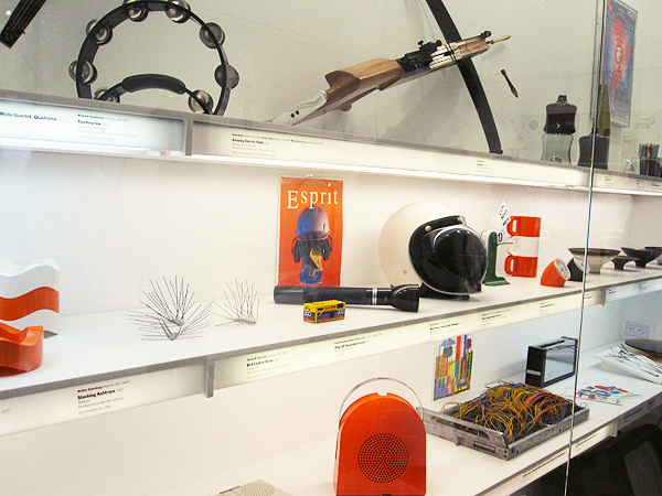
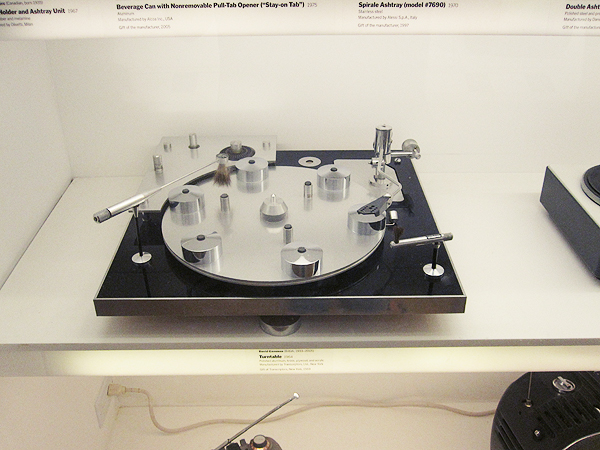
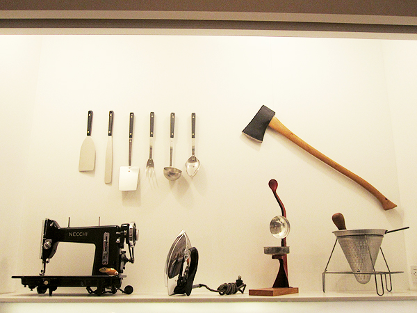
I love the room showcasing useful objects as art. So many of them are incredibly beautiful.
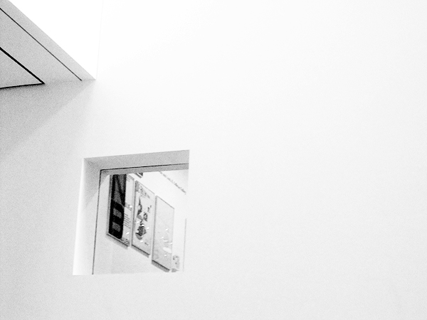
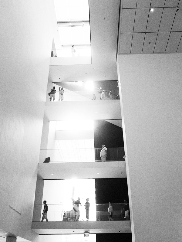
You could just see some of the typography posters through a window. And it's the MoMA, so of course the architecture is amazing.
This artist named George Maciunas kept the boxes of all his household objects for an entire year. The display was beautiful and a bit disturbing at the same time as we see just how much stuff each of us consumes.
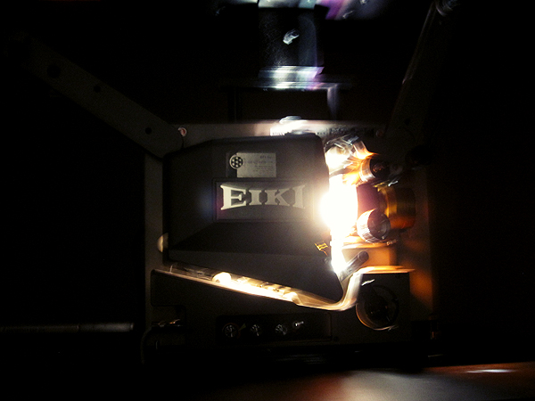
I didn't really understand the video piece happening here, but the camera was absolutely beautiful.
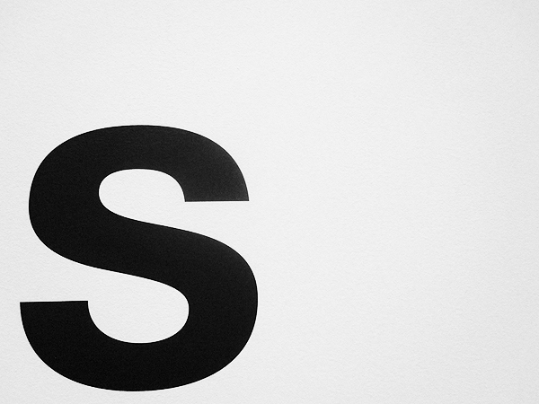
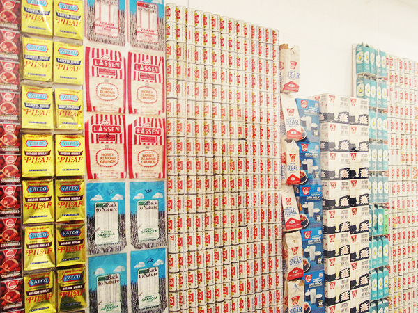
You guys know me - I can never resist huge typography.
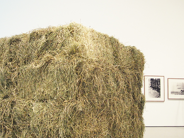
The bale of hay in the middle of this room smelled so good. I loved watching all these different types of people walk by it, then do a double take and lean in closer to smell it.
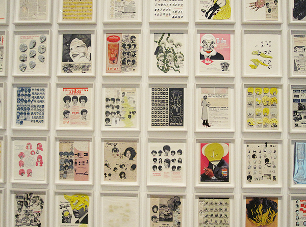
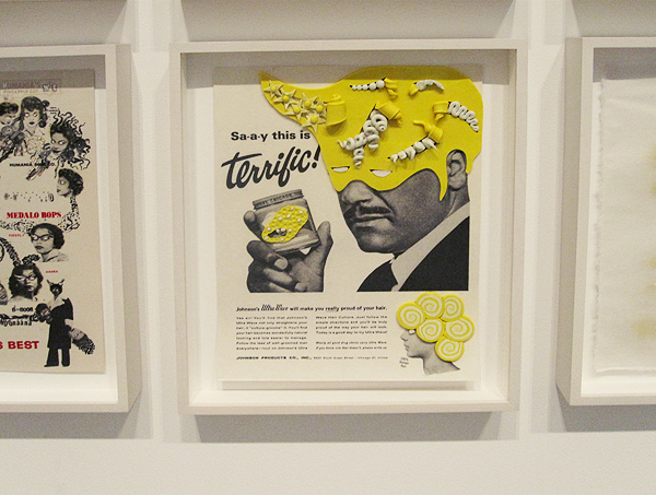
I didn't get the artist's name, but the way these ads were manipulated is hilarious and beautiful.
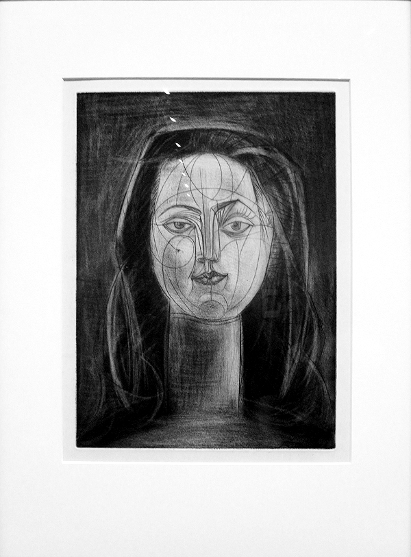
Portrait by Picasso. I'm not always the biggest fan of his work, but I thought this was gorgeous.
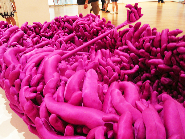
I have no idea what this thing is, but it's boat-shaped and purple and squishy and I want one.
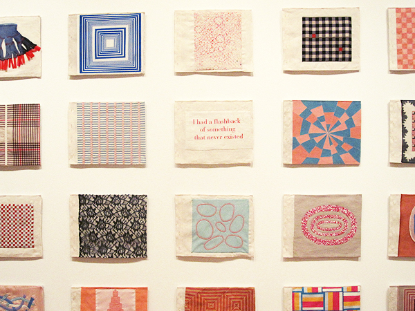
Cloth book by Louise Bourgeois. I would love to try to make one something like this one day.
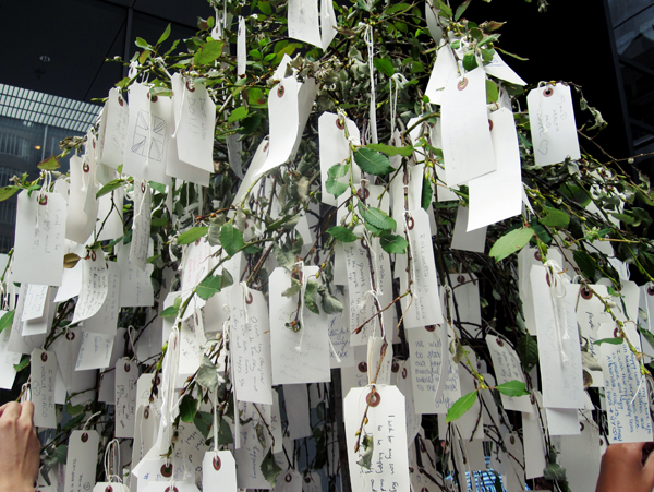
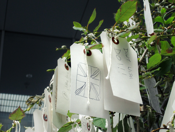
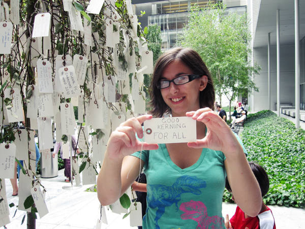
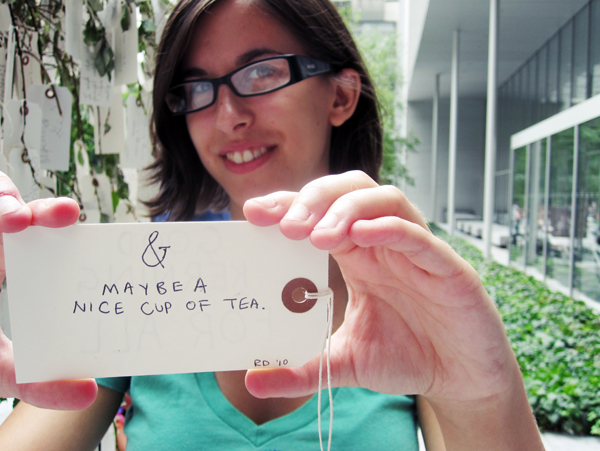
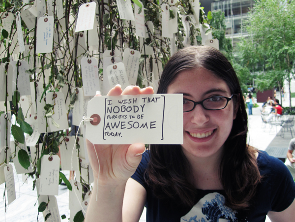
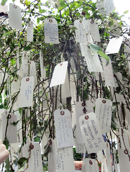
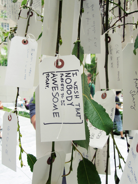
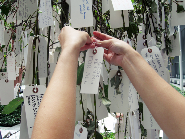
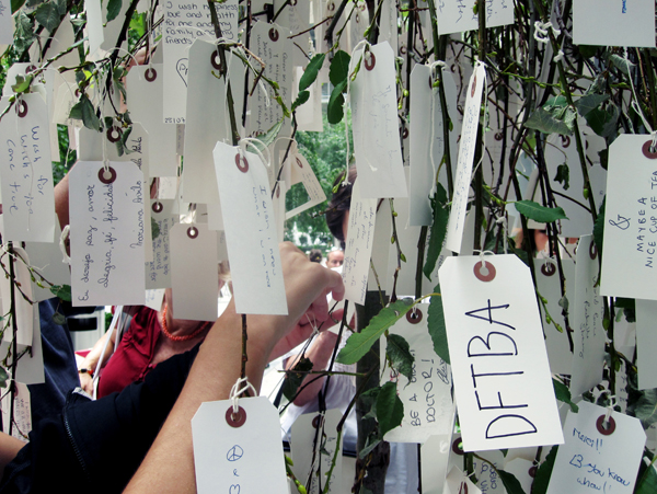
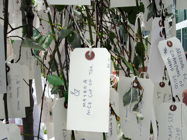
In the sculpture garden, they had a wish tree, in which you would write down a wish and tie it on. My wish proves that I am a nerdfighter through and through, and Bin's wish proves that I am not the only person in the world obsessed with typography.
Sorry this post was so long! Leave a comment below if you wish to.
There was an amazing typography exhibit which is going to be taken down this week (which is why we went on the day we did). So many of those posters I've cited as inspiration throughout my time at RISD, so it was amazing to see them in real life. I didn't want to leave, but there was more art to see.
I love the room showcasing useful objects as art. So many of them are incredibly beautiful.
You could just see some of the typography posters through a window. And it's the MoMA, so of course the architecture is amazing.
This artist named George Maciunas kept the boxes of all his household objects for an entire year. The display was beautiful and a bit disturbing at the same time as we see just how much stuff each of us consumes.
I didn't really understand the video piece happening here, but the camera was absolutely beautiful.
You guys know me - I can never resist huge typography.
The bale of hay in the middle of this room smelled so good. I loved watching all these different types of people walk by it, then do a double take and lean in closer to smell it.
I didn't get the artist's name, but the way these ads were manipulated is hilarious and beautiful.
Portrait by Picasso. I'm not always the biggest fan of his work, but I thought this was gorgeous.
I have no idea what this thing is, but it's boat-shaped and purple and squishy and I want one.
Cloth book by Louise Bourgeois. I would love to try to make one something like this one day.
In the sculpture garden, they had a wish tree, in which you would write down a wish and tie it on. My wish proves that I am a nerdfighter through and through, and Bin's wish proves that I am not the only person in the world obsessed with typography.
Sorry this post was so long! Leave a comment below if you wish to.
Monday, July 19, 2010
FakeJohnGreen REVEALED

...the title sort of killed any suspense I had going there, didn't it? Well, to make it perfectly clear,
I am Dailybooth's FakeJohnGreen.
So, now that that's taken care of, I guess I can end the blog here. Thanks for reading! Oh wait, you probably have some questions. Or, I have some questions you may be asking. If you care at all.
How did you come up with the idea?
I was talking to Paul (songsfrompaul) on Skype one day, and he mentioned that someone had made a fake Miley Cyrus Dailybooth account. I commented, wouldn't it be funny if someone made a fakejohngreen Dailybooth, since the FakeJohnGreen Twitter had been around for a little while at that point. I decided it was a good idea, made the first photo, and posted it later that day. After I made the second one the next day, I realized that I couldn't promote it myself or I would be found out immediately so I sent the link to Alan Lastufka and he tweeted about it. And it just snowballed from there. Paul and Alan knew right from the start and Alan told John and Hank, but I tried to keep it as much of a secret as I could, at least at the beginning.
Why did you stop daily photos after two months?
Quite honestly, I ran out of ideas. It came to the point where I would spend an hour trying to come up with an idea and then about 40 minutes making it, and I didn't have the time to do it every day.
Did you have any help?
Paul came up with some of the ideas along the way, though at this point I don't even remember which ones were his. Alan gave me a few suggestions too, and posted one or two of them on nights when I was out late. All of the Photoshopping was done by me though.
How long do they take you to make?
I don't think I spent more than two hours on any of them, but some of the simpler ones could take as little as ten minutes. It's really just a matter of coming up with a good idea.
It really wasn't Hank/Alan/Monica/anyone else?
Nope, I promise you. When Hank posted that one in his video before it was on the feed, it's just because I sent all the ones I had made, and I guess he didn't realize that one wasn't posted yet.
Are you also FakeJohnGreen on Twitter?
No. And I'm not going to tell you who is.
Which ones are your favorites?

Of course I have to include the one that started it all. I love how the shading I added makes it look like the graphics are actually on the shirt. Skills, right there. #modestkaren

I don't even know what I was thinking with this one.

I really, really want to make this a reality.

This idea took me about an hour and a half to come up with, but the cropping is just so, so good. #evenmoremodestkaren

This literally took me three minutes to make. But apparently everyone thought it was hilarious.

I had to photograph my BobbleJohn from about ten different angles to get this to look real, but I love how it came out.

Mostly I just love the description I wrote for this one. Let's get John to write this, mmkay?

After Hank tweeted about his Halloween costume, I only had about two hours to put this together. But I think it turned out really well, apart from using the wrong font for the V.

You have no idea how happy I was when I discovered I had the Sweet Valley High font on my computer (it's ITC Souvenir).
So why are you outing yourself now?
Well I haven't been making them nearly as frequently, and I want you guys to get some answers before you forget all about it. I will probably keep making them every so often, but in order to do that I need some ideas. So feel free to suggest stuff, and if I come across any I like, I just may make it.
Wait, I follow fakejohngreen but I have no idea who you are.
That's not a question, but alright. I'm Karen Kavett and I'm on YouTube, Twitter, DailyBooth, and I have a website. Let me know if you like them.
Well I hope that answered all your (my?) questions. If you want to know anything about a specific photo, feel free to ask and I may do a follow-up blog with more details. And really, thank you so much to everyone who has followed the account and commented and tweeted about the photos. I still get the notification emails, so I've read every comment you guys have left. Let me know in the comments here or on Twitter which your favorite photo was and who you thought was running the account!
FakeJohnGreen, out.
Subscribe to:
Posts (Atom)