The first piece I'm writing about here is one that I just made for fun without any real purpose, so I never really got feedback on it. I was bored one night about a month ago so I decided to make a tour poster for Pottercast, using all the shiny new knowledge I had acquired in my Typography and History of Graphic Design classes. I was inspired by a lecture we had had in History of GD about political posters from the 1800s (including one amazing poster for Lincoln which I am very annoyed I cannot find online). Overall I'm pretty happy with it, though I'm still second-guessing the decorative borders on the sides. If anyone has any comments or suggestions, I'd love to hear them!
The typefaces used are Joanna, Impact, Clarendon, Playbill, and Wingdings.

(Click the image to see it larger.)
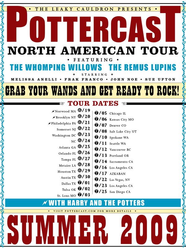
My only comment would be that having one lightning bolt on the "with Harry and the Potters" bit makes it look a bit lobsided...
ReplyDeleteOther than that, it's brilliant - and I can definitely see the inspirations seeping through!