For today, I'll be showing you guys my first project for Typography III. We had to redesign the table of contents and a food section spread for the New York Times Magazine. Here are my solutions (click for larger images):

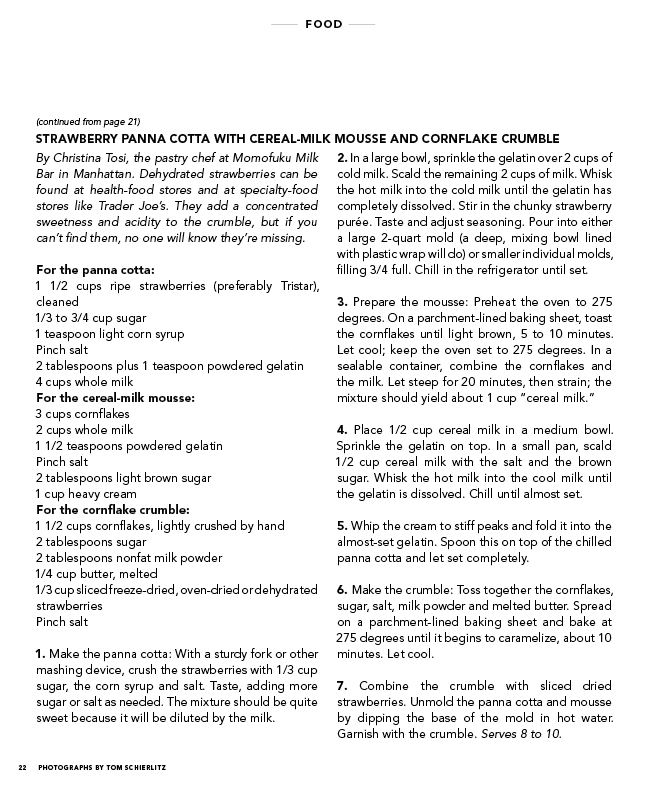
I decided to use Avenir for the body text and Din for the headers. One thing I had to learn was to keep the body text fairly large even though it meant going onto a third page. However, as cute as tiny text is, it's not practical for older readers of the magazine. Also, since the recipes also have to be functional in the kitchen, I made the type size 12, much larger than I would otherwise.
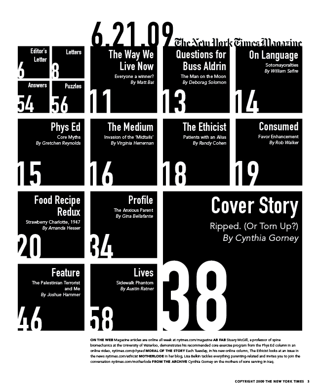
When it came to the table of contents, I had a lot of fun just experimenting with type and the different ways it could be represented.

Above you can see one of my experiments, in which I tried to show each article a different way even though it became completely illegible. In the end, I decided to go with a very obvious grid, with the feature articles getting more space on the page. Also, I tried to make the page numbers very obvious since I always get annoyed when it's hard to tell which page number goes with which article. I chose not to use any imagery in order to put the emphasis on the typographic system I had set up.
The original article can be found online at http://www.nytimes.com/2009/06/21/magazine/21food-t-000.html. Let me know if you have any questions or comments!

No comments:
Post a Comment