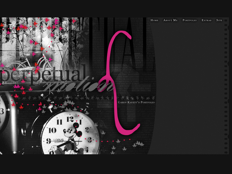
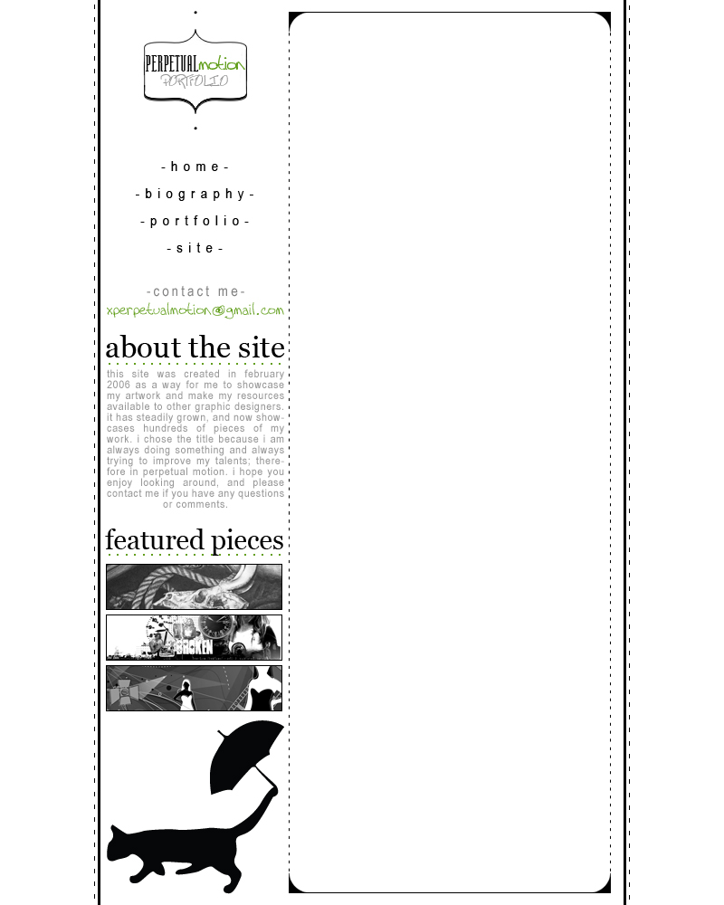
I first put together my site for my web design class spring semester of junior year of high school. This was my first introduction to HTML, so the design is pretty basic though still functional. Also, I used to call the site Perpetual Motion, instead of just karenkavett.com, so that's where my YouTube username comes from. The photos were all taken by me and the fonts used are Velvet, Georgia, Edition, Ma Sexy, Dance Floor Exit. It was launched on April 20, 2006.
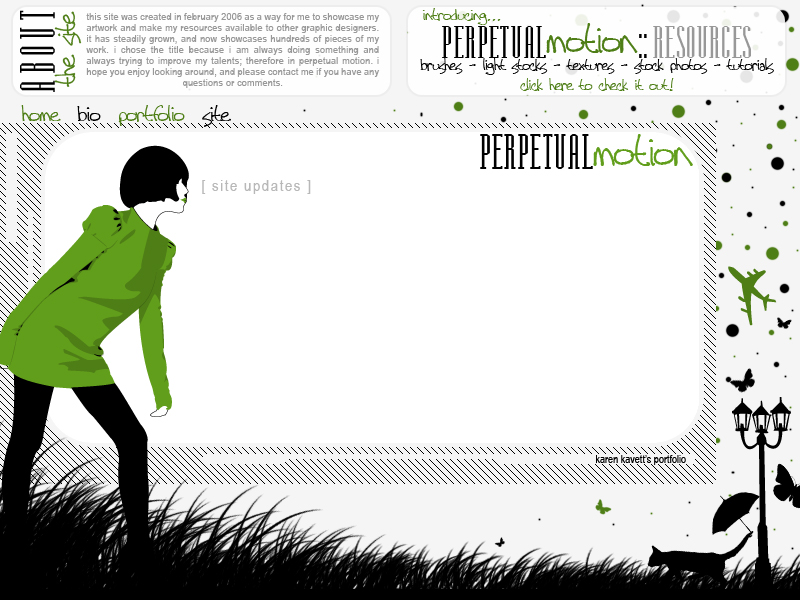
I put together this next layout in August 2006. I just wanted a change, and I also needed room to link to the other site I had just started which had resources like brushes and light stocks to give away. This is also the first time I used the cat with umbrella, which I had just stuck together randomly one day, and then I liked it enough to use it from then on. I traced the vector image of the girl from a photo of one of the Olsen twins, and the fonts used are Arial Narrow, Manzanita, and Tall Paul.
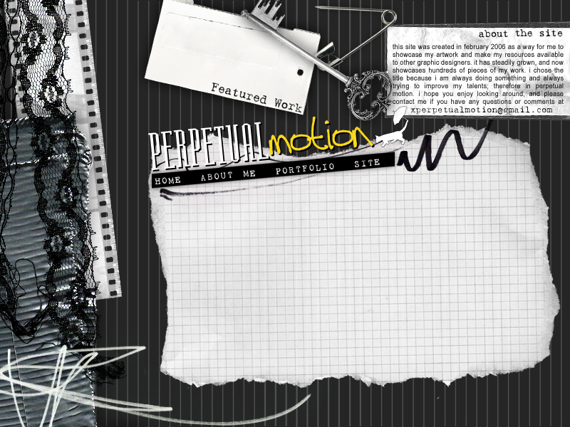
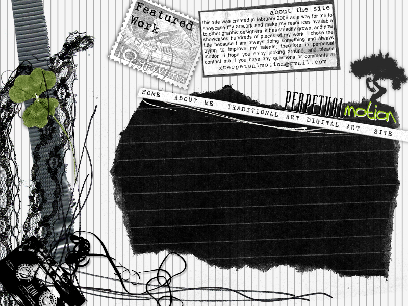
In July 2007, I decided to design the site again, but I didn't really have a clear image of what I was going for. These next two designs were candidates for the main portfolio site and the resources site, but I never ended up using them, because I wanted to expand the site a bit and these didn't really have room to do that.
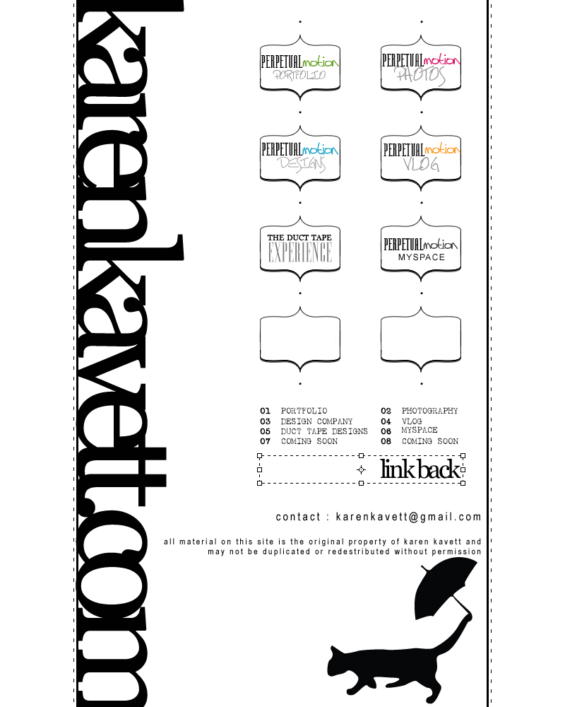
So, still in the same time frame, I went on to design this layout, which was eventually launched December 31, 2007. This was right around when I started vlogging and when I tried to sell my duct tape stuff for the first time, so I wanted a way to link to all of those different projects easily. I don't really have much to say about the design, other than that it served its purpose for what I needed back then.
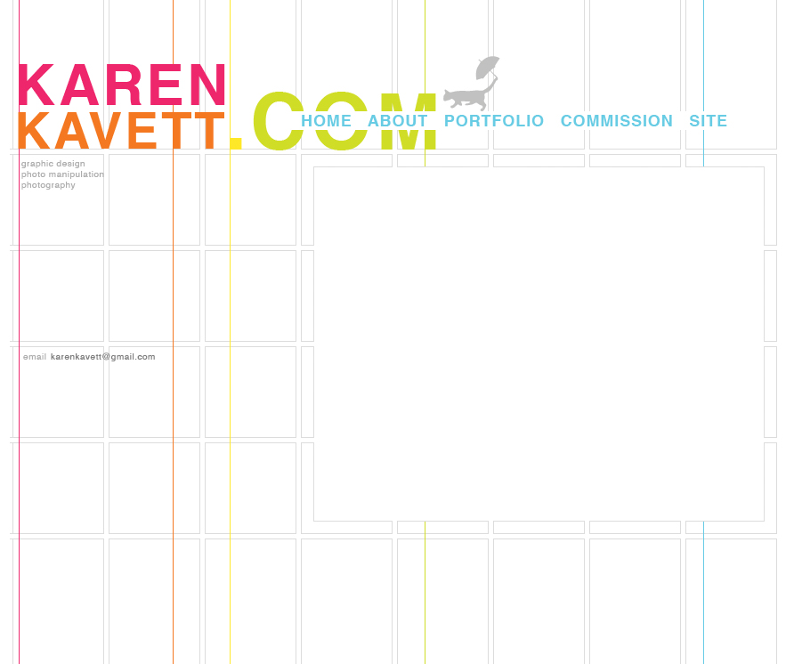
That stayed online until December 2008, when I designed what is online now. I decided to get rid of the Manzanita/Tall Paul logo and use a simple Helvetica instead. Also, I decided to change the name of the site from Perpetual Motion to just karenkavett.com. I decided I didn't need such an elaborate home page anymore, so I tried to simplify it a lot and only keep what was really necessary. When I put up this layout, I also decided to take all the fanart off my portfolio and only keep the stuff that was likely to get me a job.
As for what's coming next, you'll have to wait a little while until I finish coding it to find out. But rest assured it's unlike any of what I've done in the past (well, the color scheme is similar to the previous layout but the way it's organized is different).
Thanks so much for reading this, and please leave any comments below!
Karen, you are very talented. I'm quite jealous. I love each single design.
ReplyDeleteNot gonna lie, once things settle down for me, I was hoping to ask you to design a site for me.
I'm pretty excited to see what the new site is going to look like! All these designs are awesome, so I know the new one won't disappoint!
ReplyDelete