This post is about the New York Dumbledore's Army flyer that I designed. Info about the NYDA can be found in this video I posted this morning:
As I said in the video, I kind of appointed myself graphic designer for the group, which meant coming up with a logo and basic design style to sort of brand us, so that all future promotional material will all look like it belongs together. I also wanted to have it done by about now so that we could have something to give out at the NY red carpet premiere of HBP, which meant I had about a week. I think with more time I'll be able to flesh out the design a bit better, but I think it turned out fine for now.
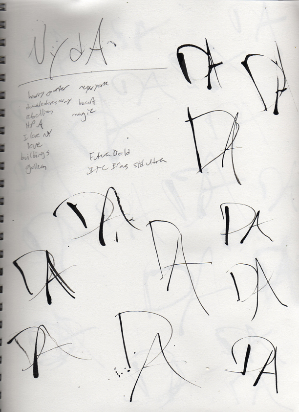
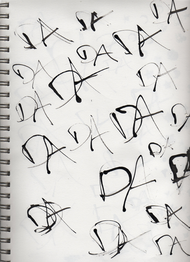
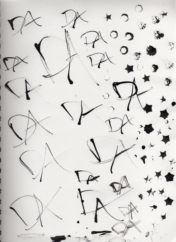
Anyway, my first thoughts for the logo were of combining the I love New York graphic (into which the HP Alliance logo would fit perfectly) with the DA logo from the fifth movie. Obviously we couldn't just steal that logo, so in my sketchbook I used various objects like screws, pen caps, and brads dipped in ink to draw DA over and over again until I got something I liked. I scanned them for you to see, if you're interested (sorry for the lack of thumbnails):
Page 1
Page 2
Page 3
(Can you find the one I ended up using?)
After that I scanned them in and livetraced one in Illustrator, and began to think about the font that NY should be in. At first I was leaning toward Futura (as seen here) but it didn't really go well with the messy look of the ink, and it was difficult to keep the reference to the I <3 NY symbol there without it being a slab serif font. So in the end I decided to go with Rockwell, which is nice and bold and looks similar to American Typewriter, the font used in the original I <3 NY graphic.
After that I started thinking about the actual design of the flyer. First I just put into a text document all the information that needed to be in it, in order of hierarchy. In terms of typefaces, I decided to use Perpetua as a supporting typeface to Rockwell because it's ery delicate looking and has a nice contrast to the sharp corners of the slab serifs (also, I just love the font and use it whenever I can). I tried to make the design envoke old wood type posters and old newspaper design, because most of the design in the HP movies seems very late 1800s-early 1900s-ish. I tried to keep the sense of magic and whimsy there with the decoratve corners and little stars.
You can see an earlier draft of the flyer and the final version (big enough to print if you so wish) here:
First version
Final version
Please let me know what you think, and if you're in New York, please consider joining the NYDA!
About Me
- karenkavett
www.karenkavett.com
www.twitter.com/karenkavett
www.youtube.com/user/xperpetualmotion
No comments:
Post a Comment