With the redesign of my website being launched soon, I thought I'd write a blog post going through all the past layouts that the site has seen, starting all the back in April 2006 when I first launched it. Also, I've decided to reveal the design I was working on in Summer 2007 but never used, which has never been seen by anyone before. Enjoy!
I first put together my site for my web design class spring semester of junior year of high school. This was my first introduction to HTML, so the design is pretty basic though still functional. Also, I used to call the site Perpetual Motion, instead of just karenkavett.com, so that's where my YouTube username comes from. The photos were all taken by me and the fonts used are Velvet, Georgia, Edition, Ma Sexy, Dance Floor Exit. It was launched on April 20, 2006.
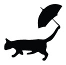
I put together this next layout in August 2006. I just wanted a change, and I also needed room to link to the other site I had just started which had resources like brushes and light stocks to give away. This is also the first time I used the cat with umbrella, which I had just stuck together randomly one day, and then I liked it enough to use it from then on. I traced the vector image of the girl from a photo of one of the Olsen twins, and the fonts used are Arial Narrow, Manzanita, and Tall Paul.
In July 2007, I decided to design the site again, but I didn't really have a clear image of what I was going for. These next two designs were candidates for the main portfolio site and the resources site, but I never ended up using them, because I wanted to expand the site a bit and these didn't really have room to do that.
So, still in the same time frame, I went on to design this layout, which was eventually launched December 31, 2007. This was right around when I started vlogging and when I tried to sell my duct tape stuff for the first time, so I wanted a way to link to all of those different projects easily. I don't really have much to say about the design, other than that it served its purpose for what I needed back then.
That stayed online until December 2008, when I designed what is online now. I decided to get rid of the Manzanita/Tall Paul logo and use a simple Helvetica instead. Also, I decided to change the name of the site from Perpetual Motion to just karenkavett.com. I decided I didn't need such an elaborate home page anymore, so I tried to simplify it a lot and only keep what was really necessary. When I put up this layout, I also decided to take all the fanart off my portfolio and only keep the stuff that was likely to get me a job.
As for what's coming next, you'll have to wait a little while until I finish coding it to find out. But rest assured it's unlike any of what I've done in the past (well, the color scheme is similar to the previous layout but the way it's organized is different).
Thanks so much for reading this, and please leave any comments below!
Friday, July 24, 2009
Thursday, July 23, 2009
New site design sneak peak
I haven't told anyone about this yet, but I am working on redesigning my website. It's coming along really well, so I thought I'd give you guys a little sneak peak. It's still similar to what is up now, but cleaner and just better designed. I'm not going to show the whole layout until it goes live, but here's a sneak peak: CLICK HERE.
(The colors didn't save quite right but I don't feel like messing with them now.)
Also, expect a post within the next few days talking about all the past layouts that have been on the site!
(The colors didn't save quite right but I don't feel like messing with them now.)
Also, expect a post within the next few days talking about all the past layouts that have been on the site!
Friday, July 17, 2009
Two posters
This post contains some posters I made back in April but never put on my website. So I'm posting them here so I don't forget next time I update it.
First, my sister asked me to design a poster for her college's production of Merrily We Roll Along. I drew inspiration for the posters from the original poster. As you can see, some elements are the same or similar, but I also added in some of my own ideas. It was kind of tough since I didn't actually see the play until it was being performed, so I only had the wikipedia article to go off of in terms of knowing the plot and other context.
I don't really have much to say about the poster, because I think it's fairly self-explanitory. I think I'm happy with how it came out, but as usual, there are definitely things I could tweak and change. The typeface used is Futura, and it was printed as an 8.5"x11" flyer.
Also, a little while before that, my sister asked me to design a poster for the other show her school had put on, Lend Me a Tenor . This poster wasn't advertising the show; instead it was advertising the opera within the show (that makes more sense if you read the synopsis on Wikipedia, linked above). All the text comes from the canon within the play, and the photo is of the guy that played the part of the opera singer in the opera within the play (did you follow that?).
Anyway, I designed the poster to look like it was made in 1934, which meant doing research in my history of graphic design books and old poster websites. I spent a long time trying to get the photo to look painted without it looking like a cheesy photoshop filter, which ended up being kind of pointless since the way they printed it, you couldn't see the texture at all. As for the typography, I don't know if I got it all right, but I tried to use fonts that were popular back then, in the sort of disorganized way that a lot of them were designed. I don't know if it's entirely historically accurate, but hopefully it's close enough.
Friday, July 10, 2009
No more Myspace
I decided today to delete my Myspace account, simply because I never log in anymore and I don't really have a use for it now that I'm keeping up with this blog. So here are all the wallpapers and stuff that I used to have on there, most of them made back when I was still a Mugglecast fangirl. Enjoy :)
- Mugglecast Live at Portus -
1280x1024
1280x1024
- Nerdfighters -
1280x1024
- Wrock Show Flyers -
8.5"x11"
8.5"x11"
8.5"x11"
8.5"x11"
8.5"x11"
- How to Apparate -
1280x1024
- Wizrockateers -
1280x1024
- HP Alliance/Whomping Willows -
1280x1024
1024x768
DOWNLOAD THIS IN POSTER FORM
9x12
18x24
1280x1024
1024x768
1280x1024
1024x768
- Wizard Rock -
1280x1024
1280x1024
1280x1024
1024x768
1280x1024
1024x768
- Mugglecast -
1024x768
1280x1024
1024x768
1024x768
1024x768
1280x1024
1024x768
1280x1024
1024x768
1280x1024
1024x768
Tuesday, July 7, 2009
NYDA
This post is about the New York Dumbledore's Army flyer that I designed. Info about the NYDA can be found in this video I posted this morning:
As I said in the video, I kind of appointed myself graphic designer for the group, which meant coming up with a logo and basic design style to sort of brand us, so that all future promotional material will all look like it belongs together. I also wanted to have it done by about now so that we could have something to give out at the NY red carpet premiere of HBP, which meant I had about a week. I think with more time I'll be able to flesh out the design a bit better, but I think it turned out fine for now.
Anyway, my first thoughts for the logo were of combining the I love New York graphic (into which the HP Alliance logo would fit perfectly) with the DA logo from the fifth movie. Obviously we couldn't just steal that logo, so in my sketchbook I used various objects like screws, pen caps, and brads dipped in ink to draw DA over and over again until I got something I liked. I scanned them for you to see, if you're interested (sorry for the lack of thumbnails):
Page 1
Page 2
Page 3
(Can you find the one I ended up using?)
After that I scanned them in and livetraced one in Illustrator, and began to think about the font that NY should be in. At first I was leaning toward Futura (as seen here) but it didn't really go well with the messy look of the ink, and it was difficult to keep the reference to the I <3 NY symbol there without it being a slab serif font. So in the end I decided to go with Rockwell, which is nice and bold and looks similar to American Typewriter, the font used in the original I <3 NY graphic.
After that I started thinking about the actual design of the flyer. First I just put into a text document all the information that needed to be in it, in order of hierarchy. In terms of typefaces, I decided to use Perpetua as a supporting typeface to Rockwell because it's ery delicate looking and has a nice contrast to the sharp corners of the slab serifs (also, I just love the font and use it whenever I can). I tried to make the design envoke old wood type posters and old newspaper design, because most of the design in the HP movies seems very late 1800s-early 1900s-ish. I tried to keep the sense of magic and whimsy there with the decoratve corners and little stars.
You can see an earlier draft of the flyer and the final version (big enough to print if you so wish) here:
First version
Final version
Please let me know what you think, and if you're in New York, please consider joining the NYDA!
Monday, July 6, 2009
Saturday, July 4, 2009
Fake CD Cover
In this post I'm going to talk about the album cover I designed for my final challenge in Vlog a Goal Every Day:
This project was fun because there were really no restrictions beyond the title, so I could go in any direction I wanted graphically, and I got to use all kinds of fun effects that usually way to cheesy for real work. As I said above, I decided to make the band a very pretentious contemporary rock band with a touch of emo-ness, who try to be all artsy but just kind of fail. I decided to make the main image the groucho marx glasses but replace the eye holes with other images that are kind of reminiscent of eyes, namely a ferris wheel and an inverted image of the moon. Then, because all emo CD covers need blood on them, I added a drop of blood that could also be taken as a tear coming out of the glasses, because that seemed very, "Ooh, look how clever we are!" Then on top of all of that, I added an image of a serene farm landscape with really dramatic clouds, which I guess could be taken to mean they're masking the pain inside of them with a peaceful exterior, but really I just thought the colors and textures would look cool.
The text I tried to keep pretty simple because I didn't want it competing with the image. The typeface is Helvetica.
Also, if you want to see what my layers palette ended up looking like, you can see it here:
http://www.karenkavett.com/blogp/fakecdlayers.jpg
And if you want to see the original stock photos, they are here:
http://www.sxc.hu/photo/851577
http://www.sxc.hu/photo/868563
http://www.sxc.hu/photo/1154350
http://www.sxc.hu/photo/1032927
http://www.sxc.hu/photo/515677
Please let me know if you have any questions. This was quite fun :)
Wednesday, July 1, 2009
Questions. Answered.
Thanks to everyone for leaving your questions. Hopefully I'll answer them satisfactorally :)
I love typography. So I wanna know what basic tools you would need to get started in doing some. Is there programs you can get for free/cheaper that someone just starting out could buy/get? How much experience with computers do you think someone would need to be able to do it successfully?
-Sara (Cleverest_Witch)
Well that depends on what you mean by "doing" typography. If you mean making your own fonts, I can't help you there since I've never done it, only read about the basics and then got scared off from how much work goes into it. But if you mean things like laying out books and magazines, the best programs (in my, and most of the industry's opinion) are Adobe Illustrator and InDesign. Illustrator's the best for manipulating letterforms for making logos, while InDesign is the best for any multi-page publication, especially if it has a lot of text. They're pretty expensive, but you can get a student discount which should make it a lot cheaper. But if you're really serious about this, you will need to know those programs really well, so you might as well start now.
In terms of experience, some of it is knowing about the computer but a lot of it is just learning about typography the same as you would learn any other subject. I highly recommend The Type Primer by John Kane. It was my textbook for my Typography I class, and it's great for learning the basics. Once you've learned the basic rules, the best thing to do is experiment. Give yourself fake projects like redesigning an ugly brochure and see what you can come up with. Also, if you ever want feedback, feel free to send me an email.
What has your curriculum been like at during art school, since you're doing graphic design? Is it all art classes, or are there other general education requirements? Do they try to incorporate art-y things into them, since it's an art school and all?
Early on, do you find yourself taking the same sort of classes as people specializing in others things like people doing illustration, painting, and photography? Is only later on that you get to really get into the nitty-gritty of what you'd like to do?
-Jethro
Well at RISD, freshman year is foundation year, which means all the freshman take classes together. Both semesters, we were required to take 2D Design, 3D Design, and Drawing, as well as two liberal arts classes which could be either art history, english, or social sciences (as far as I know, math and science classes taken at Brown don't count for anything so no one takes them).
All the freshman declare majors around March, and then starting sophomore year, we all take classes within our majors. For graphic design, the required courses for sophomores are Typography I and II (which is six credits), Form and Communication (also six credits), and History of Graphic Design. That leaves enough time to also take two liberal arts classes each semester, in which people from all majors are mixed together. Also, we have a short six-week semester called wintersession in which we're encouraged to take studio classes outside our major, so all wintersession classes are also mixed.
Do certain "camps" of art school get along very well, or are there some that are always at odds with each other? (I have in mind that at my school, philosophy/English and business majors would not usually get along so well).
-Jethro
Well, sort of. Almost all the apparel design people I've met have been pretty snotty, so I don't tend to hang around them. And the architecture majors have so much work we hardly ever see them (it's nicknamed archi-torture). But otherwise, the cliques that seem to form don't really seem to be around each major, it's just whoever ends up being friends. So no, from what I've seen, there isn't all that much rivalry between majors.
What programs do you use?
How did you start?
I really want to get into graphic design but I don't know where to begin.
-Laura
I use Adobe Photoshop, Illustrator, and InDesign CS3. They're really the standard for graphic design, so it's in your best interest to learn them. I started 6 years ago just by experimenting. I didn't know all that much about the programs, but I wanted to be better at it so I just worked really hard and made stuff in Photoshop for a few hours every day for about 4 years. If you want to start, I'd recommend checking some books on graphic design out of the library just so you have some idea of what typography is, and what is considered "good" design, and then just experiment. Don't worry if the stuff you make at first doesn't look good; if you keep at it, you will improve. Find things that aren't well designed and challenge yourself to redo them, or make up a product or band or something and create a logo and poster design for them. Or, try to design something in the style of a poster or website you like. I promise it's not copying, since you'll inevitably put in some of your own style. And if you ever want feedback, please send me an email and I'd be happy to help.
What sparked your interest in graphic design?
-phampants
This question has slowly been answered throughout older posts from this blog, so I don't really want to go through it all again. This post: http://karenkavett.blogspot.com/2009/06/cheesiness-alert.html is about as much as I'm going to tell you :P
Well, I think that was all the questions. Thank you so much to everyone who commented and I hope I answered your questions fully. If you have any followup questions or if something was unclear, please send me an email or leave a comment!
Subscribe to:
Posts (Atom)